Research Blog 1:The proposal of my website and prezi
Here is the Prezi link for my proposal
https://prezi.com/view/h2alDfq3ZThWQM2DcAE5/
concept
The concept of my website is to make a website about travel and architecture.
Ideas
Using a simple layout design, I added my ideas and thoughts on urban architecture. Introduce the architecture of my hometown based on my history and experience. Also, vivid pictures and animations are inserted to give the audience an understanding of appreciating and gaining knowledge.
The Theme
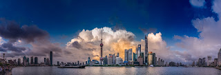
The theme of my website is the architecture in Shanghai, China. I will describe the most important scenic spots and buildings in Shanghai-based on my own experience. I will divide it into two parts, which is the combination of traditional and modern. I hope my website's overall feeling is sunshine and vitality. People who see the website can feel the website's dynamism. I will use some bright colors as the primary color.
The website will take three parts and include some pictures of Chinese modern buildings' Cityview and architecture. My goal is to create a website for people who want to travel to China or learn about Chinese cities.
Target Audience
My website's nature is a commercial tourism website, encouraging more people to come to Shanghai to travel. So my target audience is those who want to travel to China and those interested in the city's architectural style.
The goal
There should be a specific design for a particular type of website. For example, when I visit a shopping website, I can see many products waiting to be sold by merchants. For such sites, users may be impatient and have to endure painful comparisons. So, the right thing to do is to give people who view my site an easy way to find the goods to get involved in the shopping. At the same time, it also increases the chances of user action. As a tourism website, I will display each section in The Navigation Bar to provide a clear direction for customers to view my website and play a guiding role.
For the site to display the design arrangement's content, is the page will not appear too messy, give a person the overall feeling of the same. To achieve the theme is clear and prominent, the main points are clear, according to the requirements, with simple and straightforward language and screen reflect the site's theme; Mobilize all means to show the site's personality fully and interest, do the characteristics of the site.


评论
发表评论