Wireframe represents the home page layout, predesigns the title and image placement of the page, and gives the page a rough draft.
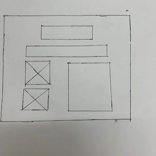
On the home page, I will insert the GIF at the top of the website, and below the title is the Navigation Bar of the website. Below Navigation Bar, there are two photos of the same size on the left, and there is content on the right.
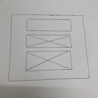
On the second page, I'll add a paragraph of text and a photo. I can design a very simple and straightforward layout.
Page 2: Traditional architecture
On the third page, I will add three photos of the same size, and the layout will be the same as the previous page, with text at the top of the three images.
Page3: Modern Architecture
The layout on the third page is the same as before. There are two pictures at the bottom of the text.The whole picture is simple and
straightforward
Storyboard
Home Page
The homepage is the most important part of the entire webpage, which represents the first page the viewer enters the website. On the first page, I will place the moving animation at the top of the website, and the navigation bar will create four hyperlinks respectively, which are home, content, traditional architecture, and modern architecture. On the left side of the page are two photos of the same size, which represent the most symbolic urban architecture. The right side is the text, and the top of the text will be the title of the homepage. Following the headings are two paragraphs, which next to the picture on the left.
Page 1: Content page
The layout of the second page will be simpler than the home page. The text and the pictures are located in the center of the website. And also set the width to 800. Set the text-align in the center of the whole page.
Page 2: Traditional Architecture Page
On the third page, I will add three photos
of traditional buildings in Shanghai, which are arranged at the bottom of the
text. Just like the text and photo arrangement on the second page,the text and paragraphs are all located in the center. A paragraph will be divided into three
paragraphs.
page 3: Modern architecture page
In the last page, I added two photos and
two paragraphs of text, the form and style are the same as before


评论
发表评论