博文

目前显示的是 一月, 2021的博文

Research Blog 14: Evaluation

      My website is mainly a commercial tourism website. In making the website, I have collected a lot of background about Shanghai architecture to make readers feel rich in knowledge.   In both the pictures and the animated pictures, I chose the buildings with an impressive city image.    Through the lectures and online sources, I learned about website construction and web page production, had a specific grasp of web page production's basic knowledge, and used Dreamweaver to input HTML and CSS code to build the layout of the website. I use some basic HTML features such as image insertion and alignment Settings,also the text format, color, background. I also used Photoshop to better process part of the pictures to better match the pictures and the web page. Using the software of After Effects to make the motion graph in the production of web pages     In the beginning, I encountered some problems when creating a web page. For example, I did not know how to make the layout of the we

Research Blog 13:layout of website

图片
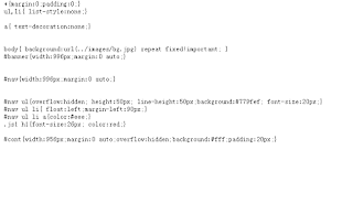
  In my page design, I chose a template that fits the theme of my site. CSS is an integral part of the web layout. Add CSS to HTML to set the style and layout of the webpage.  Function:  beautify the website, improve the browsing efficiency of the page, the page is given priority to with simple style, text background is given priority to with white. There is a site navigation bar in the center of the page, and the city night scene provides the experience of city sight. The page can be seen that the site is mainly to promote the city's architecture and scenic spots, so be generous and straightforward, not too fancy. CSS code used  Add CSS to the site root folder and then add it to the HTML page to form a layout. Table The first thing for layout is to consider is the length and width of the entire page and the ratio between length and width. In web pages, tables are used to control the layout of information in web pages, including two aspects: one is to use rows and columns to layout

Research Blog 12: Information about insert images and content

图片
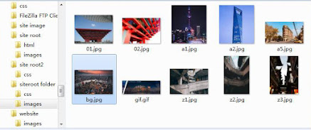
Image insert     Pictures on the web page have to provide information, display works, decorate the web page, show the role of personal sentiment and style. The image formats used by users in web pages mainly include GIF, JPEG, and PNG, among which GIF and JPEG are the two most widely used formats.      In adding pictures and GIFs, I found information from w3schools and youtube to adjust it to the appropriate size and add photos and text.     The most important thing to insert an image into the website is the <img>tag. The height and width properties of the tag set the size of the image.     If I set these properties, it can save space for the image when the page loads. Without these attributes, the browser has no way of knowing the size of the image, so it can't reserve the right space for the image, so when the image loads, the layout of the page changes.      At the beginning of the page, I used the height and width properties to scale the image. If the height and width

Research Blog11:Motion Graph exercise(animated banner)

图片
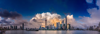
Image chose for motion graph   I chose the most famous landscape of Shanghai as the picture of my GIF choice. It shows some of the best-known buildings in Shanghai. The most famous and prominent Shanghai scenery is selected in the caption picture, allowing visitors to see the city at first glance. I used Photoshop to adjust the image's size to convert between dark and bright colors and move the text. I also summarize a slogan on a motion graph that reflects the essence of the website. The first image of my banner        Using photoshop to adjust the color of the images, Make the overall feeling of the photo dark, and create a contrast with the last photo. Create a sense of dusk and morning. Gifs can be given a more layered feel. After Effects  Firstly to create a new layer (1920*1080)    port the material Into After Effect  in AE It is to move the graph at the position keyframe, and then use the expression loop, the background there to use the mask, the principle is the same as cha

Research Blog 10: Font for the website

图片
   Type size, font, line spacing Type size can be calculated in different ways, such as points or pixels.     The body part of the page is composed of much single t.ex.t after the composition of the group, to give full play to the shape of this group in the layout of the overall role. From the perspective of art, the font itself can be regarded as an art form, which has a great influence on people in terms of personality and emotion. In web design, the handling of fonts is as critical as the handling of color, typography, graphics, and other design elements. In a sense, all design elements can be understood as graphics. Font layout For the font layout, I choose the left layout. This arrangement has loose and tight, empty and solid, pulsating and elegant, producing the formal beauty of rhythm and rhythm. The left alignment is natural in the way people read. Also, I will keep the line spacing between 1.5 and 2.0 times the font size. Emphasis of words Enlargement and decorative placement

Research Blog 9:Wireframes and storyboard

图片
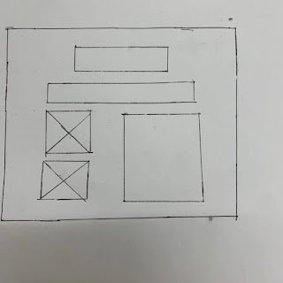
Wireframe represents the home page layout, predesigns the title and image placement of the page, and gives the page a rough draft.  The index page        On the home page, I will insert the GIF at the top of the website, and below the title is the Navigation Bar of the website. Below Navigation Bar, there are two photos of the same size on the left, and there is content on the right. Page 1: Content page On the second page, I'll add a paragraph of text and a photo. I can design a very simple and straightforward layout. Page 2: Traditional architecture              On the third page, I will add three photos of the same size, and the layout will be the same as the previous page, with text at the top of the three images.   Page3: Modern Architecture   The layout on the third page is the same as before. There are two pictures at the bottom of the text.The whole picture is simple and straightforward Storyboard Home Page                 The homepage is the most important part of the enti

Research Blog 8: Flowchart

图片
      On the basis of demand analysis, the website is determined to be composed of the following modules: home page, content, traditional architecture, and modern architecture. The home page also includes two pictures, the following is the overall structure of the website.        I used Xmind to draw my flow chart. In the middle of the red part is my central idea: the architecture found in Shanghai. Next is the home page. The home page mainly contains the title of "Welcome". It introduces the characteristics and style of the building and two pictures of famous landmarks in Shanghai. Followed by the content page, it is about a historical photo and text introduction and my thoughts and experience of architecture. The third page is three photos of traditional buildings and the historical background of the buildings. The fourth page's website is Modern Architecture, and the text introduces the most distinctive urban architecture with Chinese characteristics and its significan

Research Blog 7 :Images prepared for website

图片
 What background image will be used for the cover of the website?       I chose a photo with the most urban features as the cover of the photo, and a photo at night can bring some visual appeal to the site. I can also better know the subject content of my website through the photos. The night view of the city building can increase the visual site.       The requirements of pictures are related to the content of the page, so the pictures used are some pictures related to urban buildings. Hope to attract the attention of netizens, can play a very good advertising effect, coupled with the use of Photoshop modification and production of pictures, so it can design a better webpage How will these pictures be distributed? I want the site's images to be evenly and easily distributed across each page.  Home page For the first page of my site. I will choose the two photos that best express the image of Shanghai. “The Oriental Pearl TV Tower and the World Financial Center are two skyscrapers.

Reasearch Blog 6:Design of the website

图片
How would I arrange each page of the site?       The layout of my website is mainly four pages. For the first page. I will insert two pages and some content. On the first page, I will add a picture of the building and adjust it to the right size. For the second page, I will add a piece of architecture about the historical style of Shanghai. On the third page, I will add an element of architecture about Shanghai's historical style. The text will add the architecture and information provided to the visitors at the top of the picture. On the fourth page, I will introduce the buildings that embody Shanghai's modern and historical sense. Selection of images        In selecting pictures, I will choose a relatively high definition and distinctive images so that people watching the website will have more intuitive resonance and visual impact. See the title may want to a site to choose a picture is not difficult. With the improvement of the current bandwidth, the use of large images in